I see all you talented people have been doing what you do best! Creating new looks for your home, tackling home projects, cooking up good food and just blogging your little hearts out.
In the meantime I’ve been walking all over Dallas Market
This picture is taken from about the seventh floor
Here’s Up

And here’s looking down….

There are approximately seventeen floors and it’s blocks wide. Even with all these many, many people and showrooms and steps we took, I managed to find a blogging buddy, Kristen! We had planned this out ahead so we would be sure to find each other in the crowd.
I know many of you adore her blog. She is extremely talented. None of you will be surprised when I tell you she is just as sweet as she is creative! Oh! I ordered one of her great frames that she brought for me! It’s beautiful….

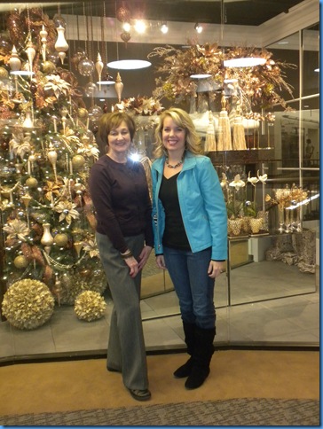
Oh my, I could be her mother!!! ;;;) Isn’t she cute?
We were getting a glare from the window, but it just seems appropriate to show you a pic in front of a floral showroom! Most of my time is spent in floral and I know Kristen was doing some looking around too. I met her friend, Sherry too. Another nice lady! I would love to see her floral work as well.

Here is an article from a publication I picked up at market called Home Accents Today. It’s always very interesting to see their picks each year for what’s in and what’s out. I don’t necessarily agree with all of these points. How about you? I wonder who decides this?
* * * * * * * * * * * * * * * * * * * * * * * * * * * * * * * * * * * * * *
Retail update
Susan Dickenson, Retail Editor -- Home Accents Today, 1/1/2010
An interesting thing happened when I solicited retailers' picks for this month's annual In & Out list — I received about three times as many "Ins" as "Outs." Is it the result of better inventory management? Positive thinking? Or, in these recessionary times, a sort of "Stand by Your Manufacturer" loyalty?
As in years past, the results represent a variety of geographic areas, store sizes, merchandise categories and price ranges. They also reflect a variety of tastes — for some, blue is definitely out while others are selling it in every shade; some retailers say shine and metallics are flying off the shelves, other shops are shunning sheen.


In
- Red
- Purple, in all hues
- Primary colors
- Bright colors and combos, especially green and blue
- Muted tones, such as browns and grays
- Orange, red, brown and blue combinations for textiles
- Pillows with bling in stitching, beads and/or fringe
- Plum and light blue replacing brown and blue color schemes
- "In the new year, our products will focus on what we saw at market — gold, yellow, teal and brown, plus black and white combinations"
- Greenery that leans toward natural garden and spice variety
- In florals: Burnt orange, bright to arid yellows and golds, deep reds and burgundy
- Mixing old with new
- Character
- Pairing upholstery covered in natural fabrics like linen with rustic, old (or old-looking) case pieces
- Understated chic, comfortable, well-priced goods.
- Homey, "we've-had-this-old-expensive-thing-forever" looks
- Candles
- Throws
- Pottery
- Small artwork, like canvases and framed prints
- "Repurposed, reclaimed, recycled furniture and accessories."
- Monkeys
- Bling Western styles: soft leather lampshades with gemstone beads, barbed-wire chandeliers with crystal embellishments
- Cozy, warm chenille throws in all price ranges and colors
- Crosses, religious items, inspirational sayings, motifs, words
- "We are in a coastal community so everything nautical.
- Crosses
- Nature
- Animal prints
- Animal prints in non-traditional colorways
- Large scale floral prints
- Fleur de lis
- Butterflies
- Honeybees
- Bird themes
- Geometric repeats
- Facets
- Barware
- Chrome
- Silvery blues
- Metallic and embellished wallpapers
- Mirrored dining table pads
- Bedding
- Metallic leather
- Cashmere blankets
- Crystal ... everything!
- Tone-on-tone damask
- Original artwork purchased as investment
- Americana
- Mediterranean
- Antique chairs upholstered in modern fabrics
- Photo frames
Out - Red
- Blue
- Brown
- Quantity over quality
- Anything too shiny
- Showy labels
- Formality
- Firm pricing
- Tea accessories
- Over-the-top ornaments
- Antique gold
- Matchy-matchy bedding ensembles
- Exaggerated arms on upholstered seating
- Fussy floral arrangements
- Equestrian/hunt themes
- Black lampshades
- Mass-produced artwork
- Tuscany
The one that makes my hair stand on end is the point about the hunt theme is “out”! I just did my family room in hunt theme and love it! Are there any on this list you don’t agree with?
Personally, I think if we love something and it makes us comfortable in our home, it is never really out. It’s just the way we like it, like good food for the soul, it’s the way we’ve put together what we love.
It’s good to be home with my dust and my decor!
Donna


